


Building coherence at
global scale
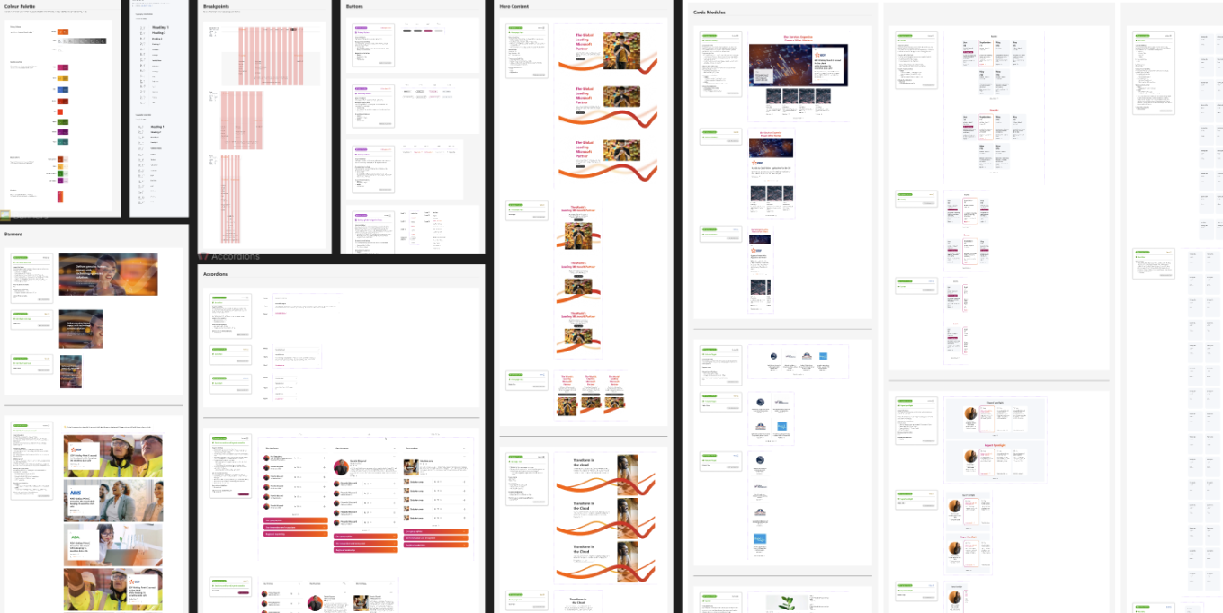
PURPOSE
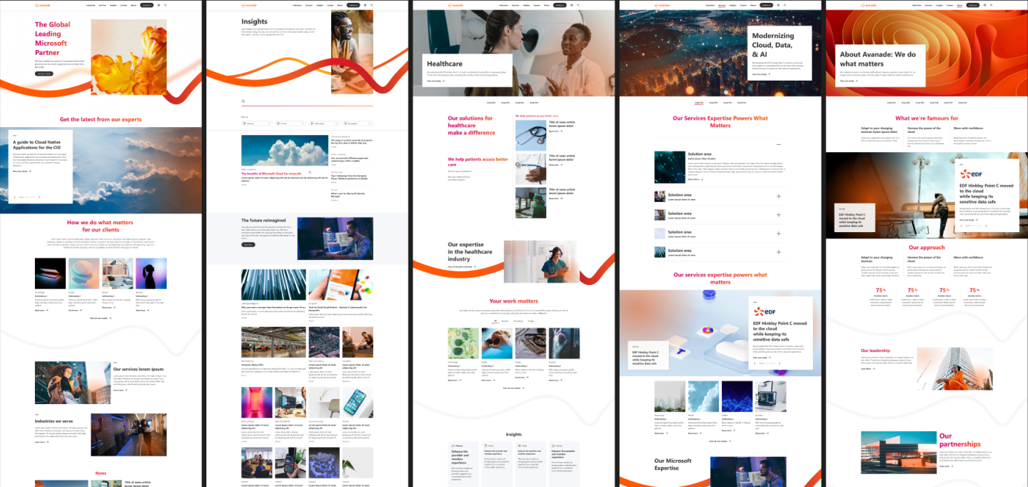
Reimagine a global consulting brand’s public website to reflect its evolution from a service provider to a human-centered technology leader. The redesign aimed to unify visual identity, voice, and interaction while improving performance and accessibility across regions.
MY ROLE
As Creative Lead for UX, UI, and Content Strategy, I worked with the Chief Creative Officer and Chief Marketing Officer to align creative direction with business growth goals. My focus was on defining the design system, content hierarchy, and user-journey architecture that would scale globally.
TEAM & CADENCE
Cross-functional collaboration across design, brand, engineering, and marketing teams distributed across three regions.
Timeline: 12 weeks from discovery to launch handoff.
OUTCOME
A cohesive, scalable web platform that improved engagement metrics, streamlined content governance, and set a new visual and interaction standard for the brand worldwide.
ROLEUX Lead
CLIENTAvanade
DATE2023 - 2024
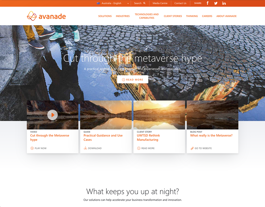
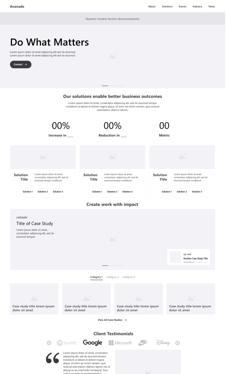
Previous Design
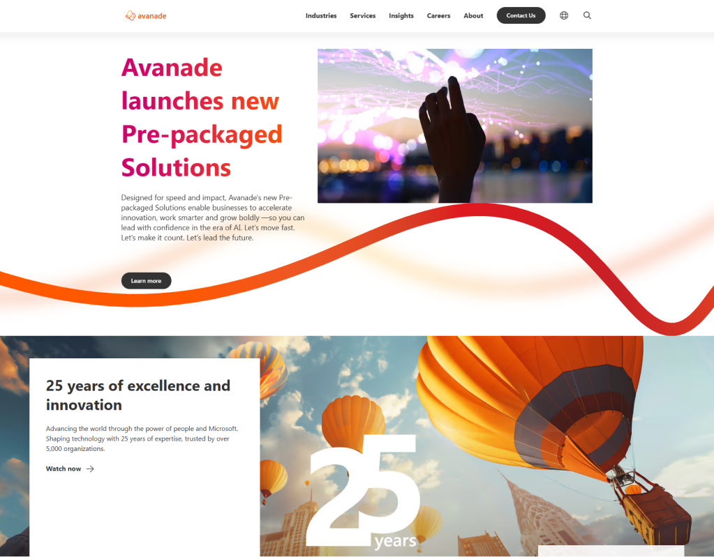
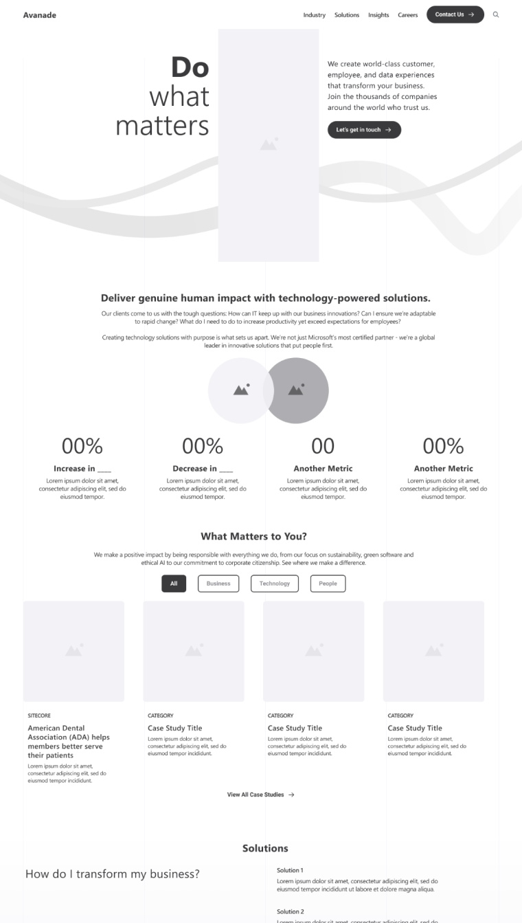
Refreshed Design


.svg)


.svg)
